2020 Corporate Identity Renewal
Integrated Branding

Design illuminating activations around the world with us.

THANK YOU FOR YOUR REQUEST
Thank you very much for your interest in EIDETIC MARKETING.
We look forward to working with you.
We will contact you soon.Thanks Again.

THERE WAS A PROBLEM WITH YOUR SUBMISSION.
Have you checked all the required fields?
We want you to write your Company, Name, E-mail, Budget, Country to Execute, Website URL, Wanted Services and Project Description.Thanks.
Integrated Branding
Integrated Branding
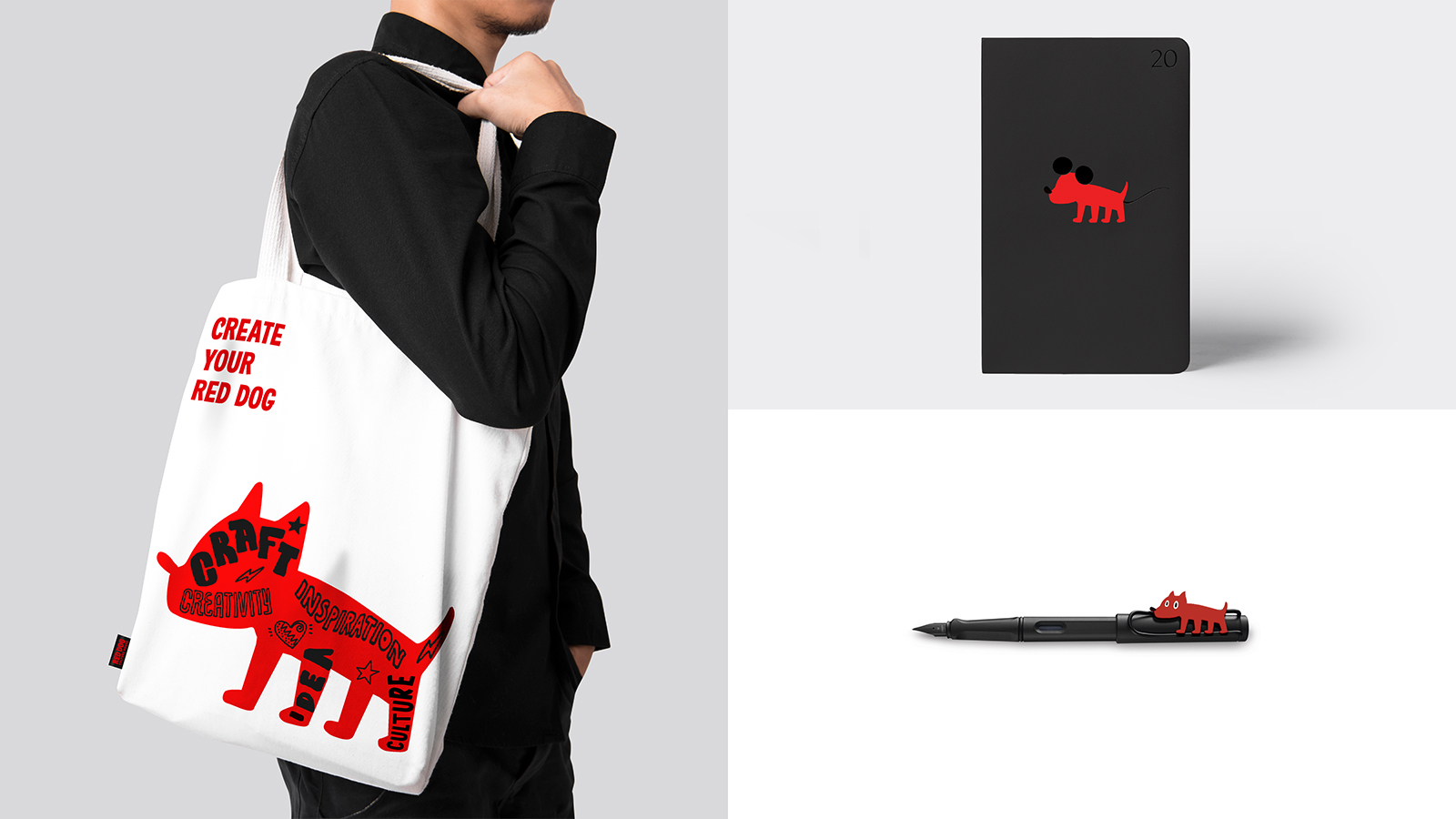
Project Background
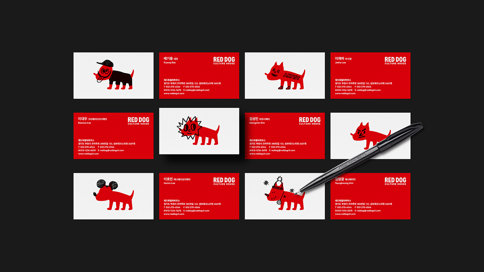
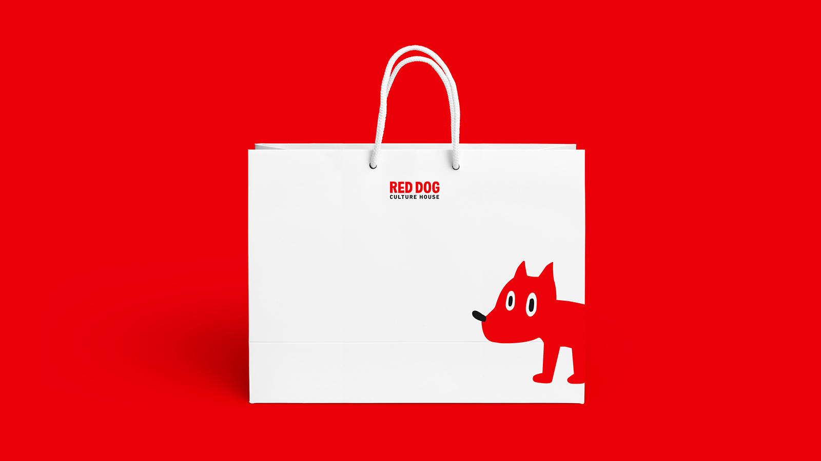
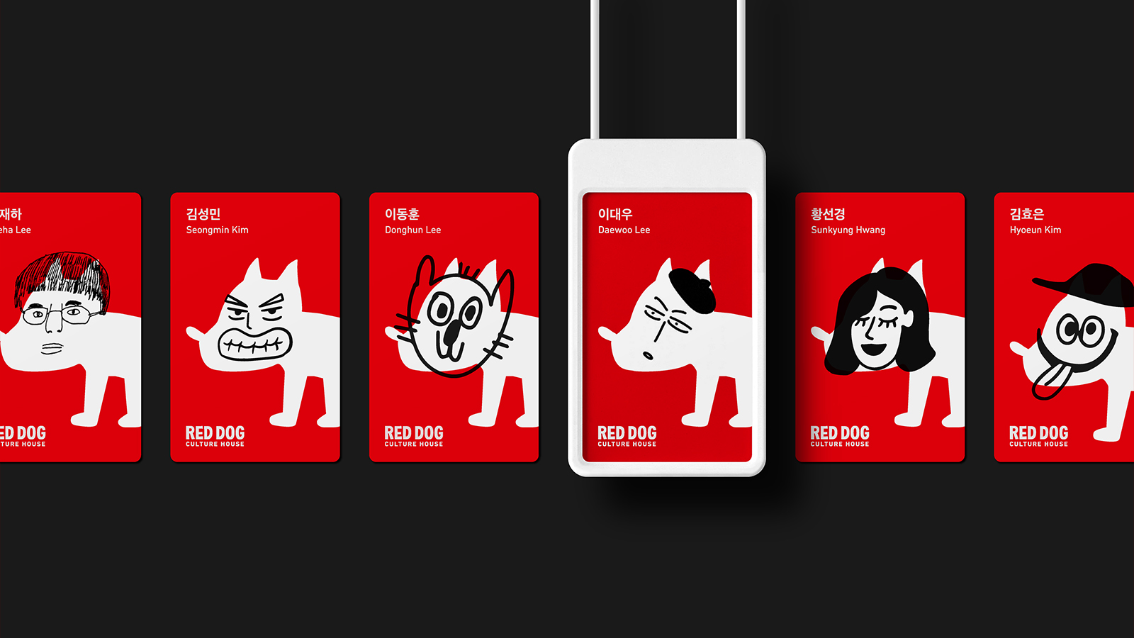
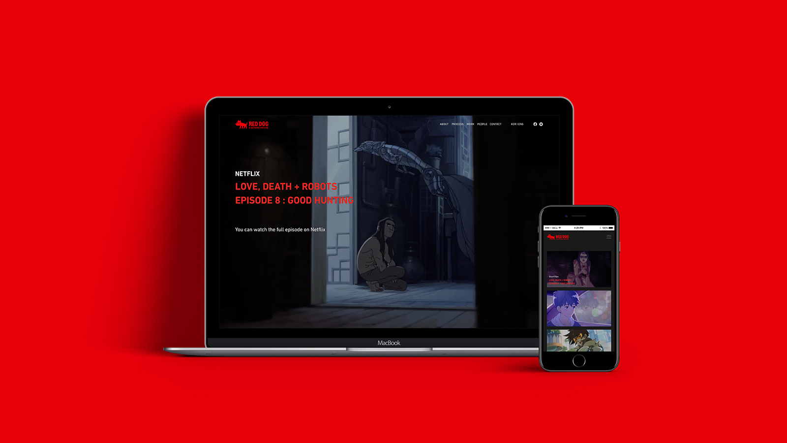
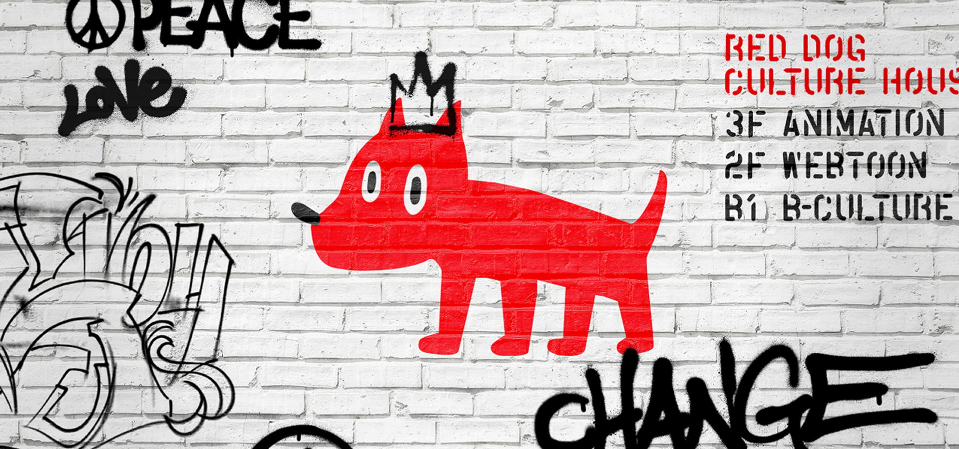
Red Dog Culture House is a South Korean 2D animation studio. Having done animations for the Netflix animated series ‘Love, Death & Robots’, they are growing into a creative studio oriented towards providing not only animation services, but comics, content publishing, and other services as well. In order to differentiate themselves as a leading subculture company with new core values beyond the Red Dog Culture House known by fans at home and abroad, they proceeded with an integrated rebranding project.Our Solution
The words 'Red dog', 'Culture', 'House' were the keywords which we utilized to develop the brand concept and image. Red Dog is an effective symbol to represent the brand as an intuitive and strong motif. For Culture (subculture)' which represents the brand concept and core values, we played with an unconstrained expression of character, not a formulaic shape, to express the image of subculture. House represents the collection of stories that gather all these remarkable artists together, and is the place where each artist can bring their own ideas and drawings to life.